What is a bitcoin rainbow chart, and how do I read it? In this review, you will know the chart’s definition of accuracy.
As is known, the fluctuating price of bitcoin makes traders sometimes confused about determining the proper steps in making decisions.
It happens because the value of bitcoin is corrected daily, and it is straightforward to be frightened by the fast ebb and flow of the coin.
As a result, traders also need help from candlestick patterns or looking at on-chain data.
However, one chart can be used to monitor general market conditions, namely the bitcoin rainbow chart. Here is the full review.
What is the Bitcoin Rainbow Chart?
The Bitcoin Rainbow Chart is a logarithmic chart of the bitcoin (BTC) price evolution.
As the rising curve of the chart is divided by several levels of color, a rainbow-like shape appears. Published on blockchaincenter.net, the chart was later called the rainbow chart.
With this chart, traders can see the evolution of the cryptocurrency against the dollar since 2009 and the trend of high valuations over the years.
Who Invented the Bitcoin Rainbow Chart?
Holger’s CEO, Ber Holger, is the inventor of this chart. He is also responsible for website content, using logarithmic regression introduced by Bitcointalk user Trololo in 2014.
As additional information, with this chart, traders can get the right moment to buy or sell their bitcoins.
How to Read Bitcoin Rainbow Chart
So, how do you read this chart?
How to read this chart is relatively easy. This can happen because each color has its meaning.
For example, if the price is blue to green, it shows “oversold.” Meanwhile, when it is in yellow, orange, and red, it means “overbought.”
It is essential to note the blue and green color zones indicate the right moment to buy bitcoin. For investors who want to accumulate, he will do so when the price is in the zone earlier.
When the price touches the yellow, orange, and red regions, it becomes a sign for investors willing to sell bitcoin.
Even though it is considered less accurate, this chart reveals exciting information about crypto prices. This chart shows that the cost of Bitcoin will immediately skyrocket one year after the halving.
For example, in 2013, the price of bitcoin hit an all-time high of $1,000. Then, in 2017, the crypto hit another peak at the $20,000 level. Meanwhile, in 2021, the price of bitcoin again touched an all-time high (ATH) at $68,000.
Is the Bitcoin Rainbow Chart Accurate?
The next question is, “Is this chart accurate?”
Hogler, the inventor of this chart, stated that the chart was made without a scientific basis. However, this chart allows the reader to observe price movements in the long term by ignoring the inevitable disturbances of daily volatility.
In addition, traders using this chart will also get an idea of ??the past best times to buy or sell bitcoins. However, Holger also said that this Rainbow Chart is not investment advice because past performance does not indicate future evolution.
This chart will only divide the bitcoin price into rainbow colors with information in the form of “bubble,” “sell,” “buy,” “still cheap,” “FOMO (Fear Of Missing Out),” “HODL (Hold On for Dear Life),” “bubble formation,” “discount,” and “accumulation.”
Thus a review of the bitcoin rainbow chart is essential to know. See articles about crypto assets, blockchain, and others only at Indodax Academy.
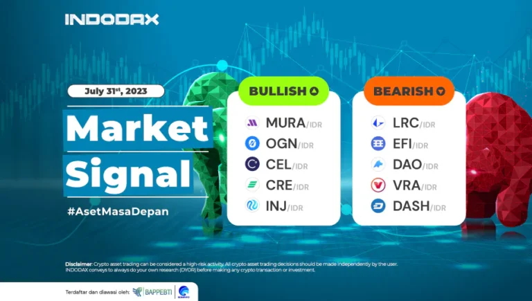
 Market